

Project Summary
Founded in 2009, RelPro Inc. is a New York based software enterprise that aggregates online relationship intelligence for business professionals. The core product is a SaaS web app that empowers B2B sales and marketing managers to quickly find accurate, real-time prospects to efficiently identify connections, deepen their understanding and strengthen professional relationships. Through our collaboration, it has …

Relpro has been named to G2 Crowd's High Performer's List for Fall 2017 and Winter 2019.
My Role
I joined Relpro Inc as a UI/UX Designer in September 2017, when there were only two designers including me. In this case, I was lucky to lead the UX design work in every project from its initial concept generation to launch. Under the mentorship of our Head of Technology Raaj and the whole tech team, I was able to learn the way to design new features from 0 to 1 and iterate the features from 1 to 100. As a UI/UX Designer, I...
Analyzed users' behaviors through our back-end admin app
Conducted Heuristic Evaluation for the entire product
Discussed product strategy with Business Analysts
Ideated 3-4 design proposals for each project
Created wireframes
Individually designed the UI
Researching and comparing various JavaScript APIs to implement the design
Collaborated with the other UX designer, front-end developers and CEO
I'm going to showcase my work by a few case studies here.
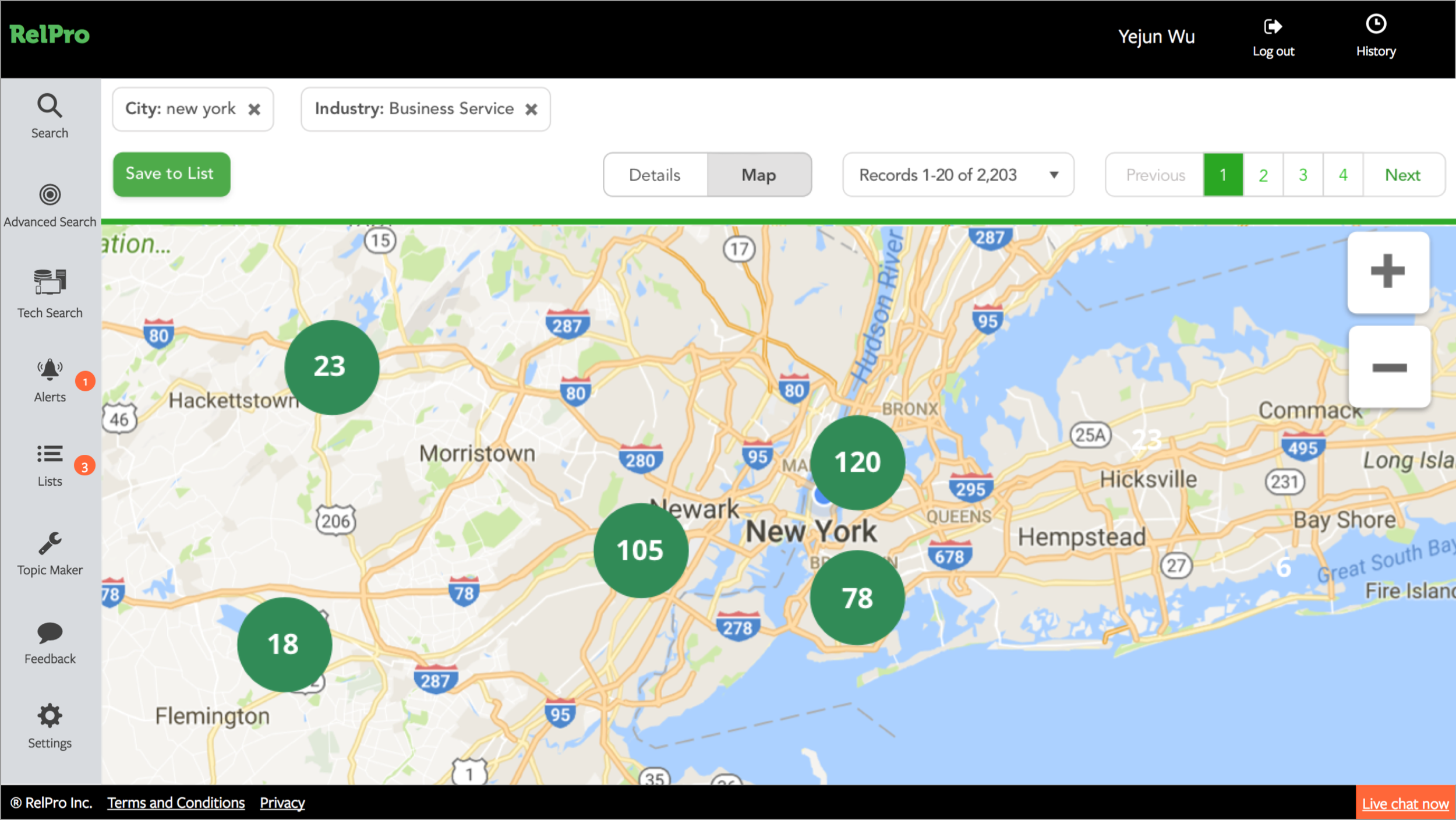
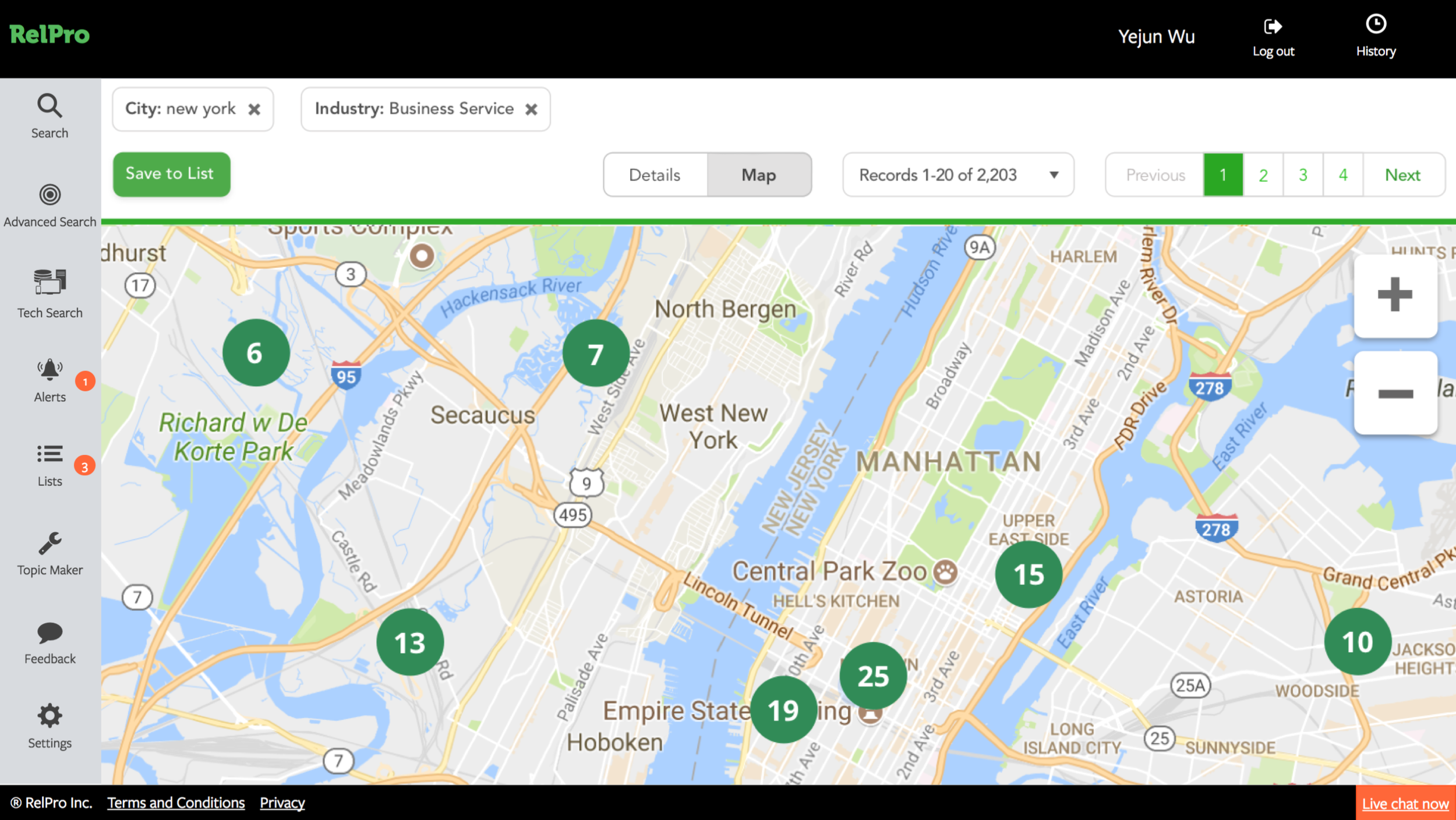
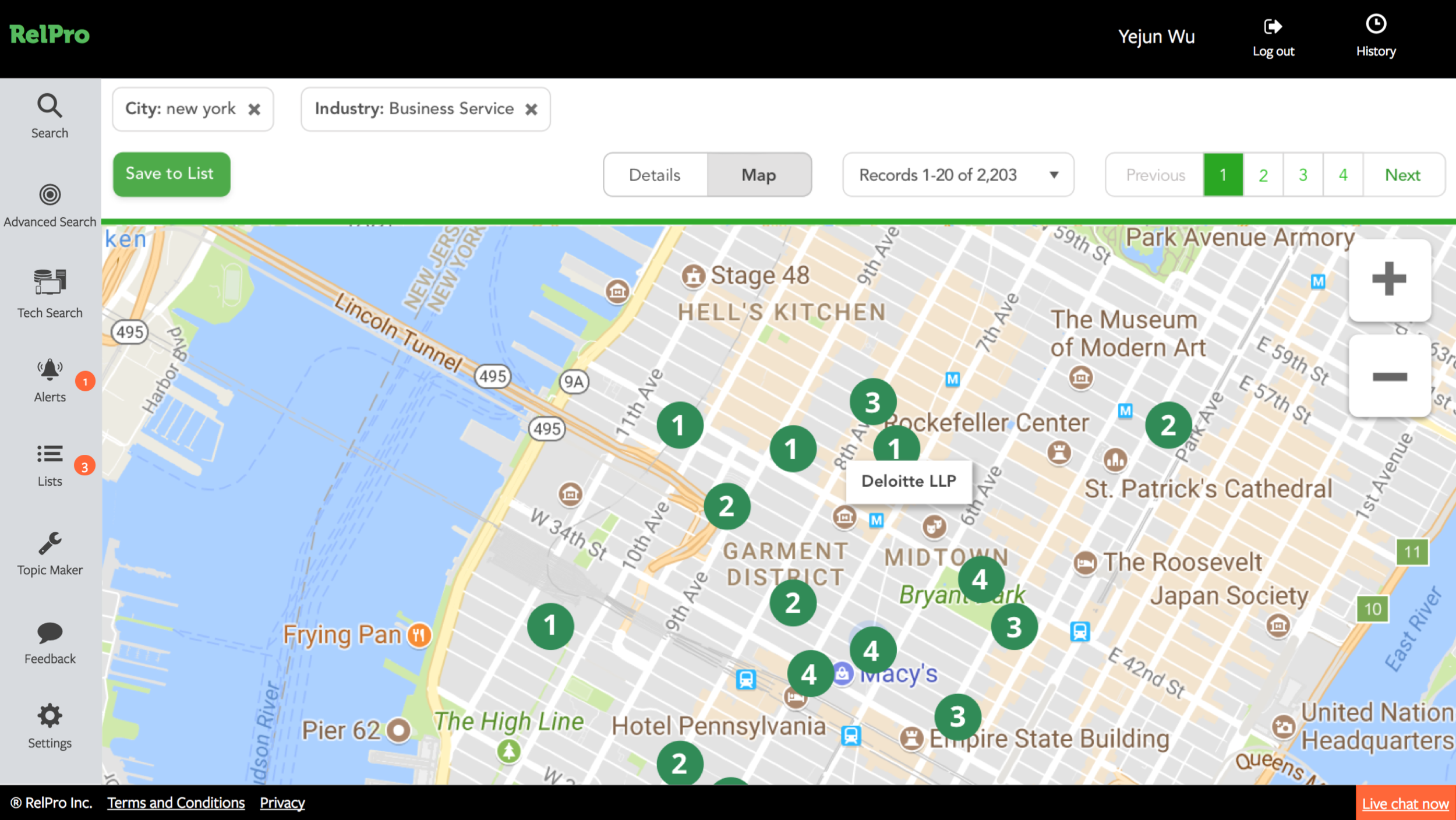
Case study 1: visualizing business intelligence data on a map
One of the most important firmographics in Advanced Search is location. By narrowing down the location to a specific country, state, or city, users can efficiently focus on the companies in their target regions. However, based on our user feedback, we learned that most users would like to see the locations of the results on an interactive map, so they can better visualize the scope and number of their prospects.
Pain points of the previous version
My solution: an interactive map to display useful information
Taking insights from user pain points, I then began to ideate design solutions around an interactive map to display information handy to users.
The first sketch
I started sketching immediately and did an initial paper testing with the tech team. 2 major problems caught my attention.
The second sketch
Based on the feedback from the team, I made some changes in the second sketch: I decided to use the map clustering instead of a traditional map showing all the data points, because sometimes users can get a large number of data points on the map which is hard to read and analyze. When a user views the map at a high zoom level, the individual data points show on the map. When the user zooms out, the markers gather together into clusters, to make viewing the map easier, therefore significantly improving the user experience.
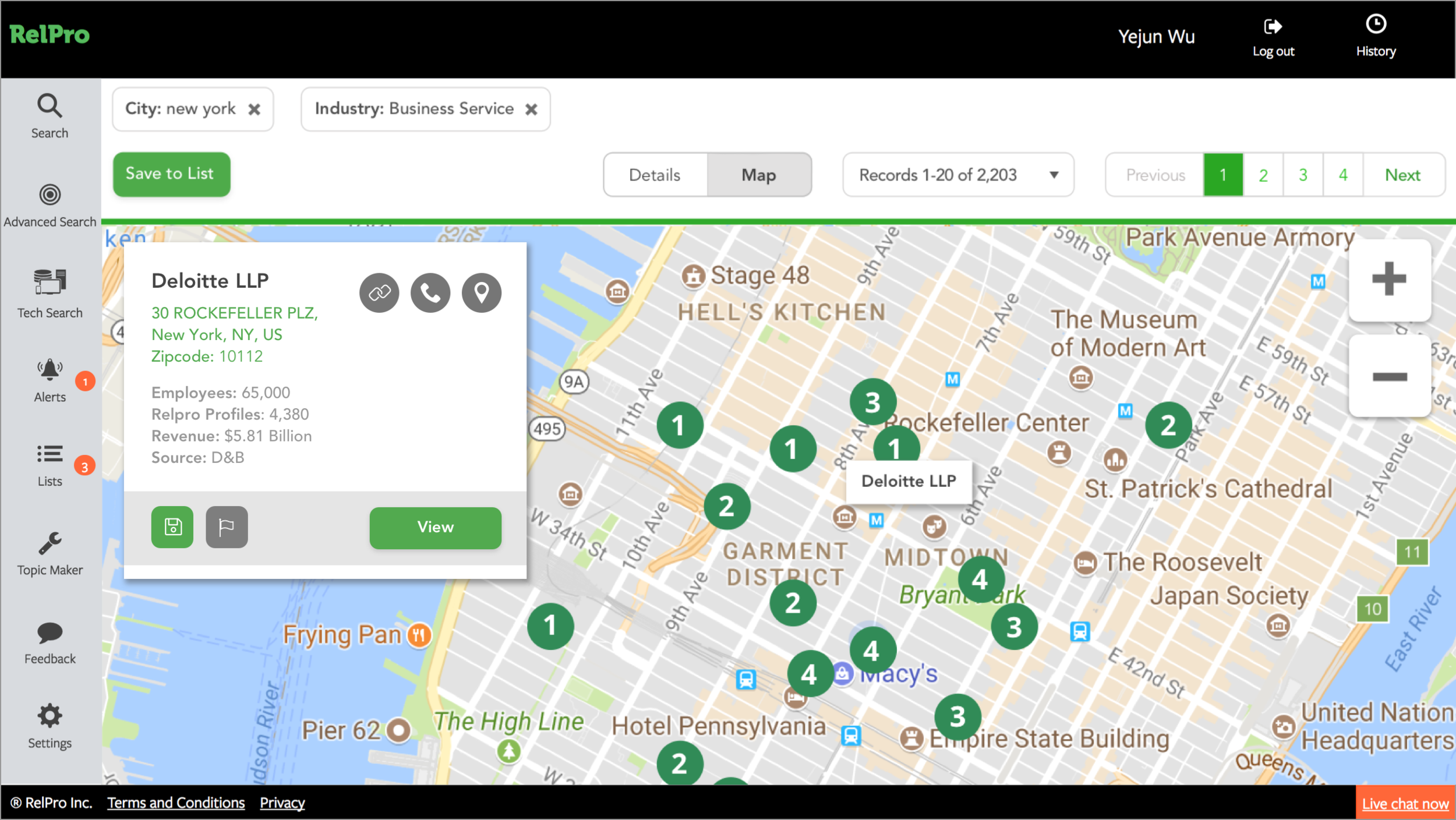
High Fidelity Prototype
After working closely with CEO, CTO and the customer success team, we successfully launched the map search through an agile product development process.
Case study 2: incorporating corporate hierarchy data to company profiles
Learning from back-end user data and user feedback that users sometimes need to find out the corporate relationships between certain companies, I initiated the iteration of the corporate hierarchy page.
Under the supervision of our Head of Technology, I mocked up four design ideas in implementing both a corporate hierarchy tree and an interactive map, with one of them percolating to the final release. By collaborating closely with software engineers, I strived to tailor the design of the user interface based on our data structure while intuitively visualize the data for users to gather the information efficiently.

High Fidelity Prototype
My final prototype enables users to click on any of the companies through a clickable corporate hierarchy tree and immediately locates the company on a map with the detailed company information below.


Since currently there’s no digital product on the market for users to clearly find out corporate affiliation data, our clients have been exceptionally satisfied with this powerful feature, as we replaced their repetitive and aimless search online with an interactive interface showing the branches and subsidiaries of a particular company.
Feature Demo
Case study 3: redesigning the company profile page
I was also asked to redesign the company profile page. The primary design objective is to aggregate data from different sources into one profile page, so users can save a lot of time entering different profile pages of the same company.
Pain points of the previous UI
Need to scroll down a lot to view all the essential information
Need to open a new profile page to see the info provided by the other data sources
The sticky notifications on the bottom left corner of the screen are quite disruptive
Less control of the information
The 'name card' occupied a lot of useful space
No map showing the actual location of the company
No profile pictures for People and Favorite Roles
Simplicity matters
High Fidelity Prototype
The redesigned company profile page functions more as a dashboard, which offers users more control of the information. One of the add-ons is a bar of each company’s main stats, which offers users a quick overview of the company before they decide to browse more detailed information.
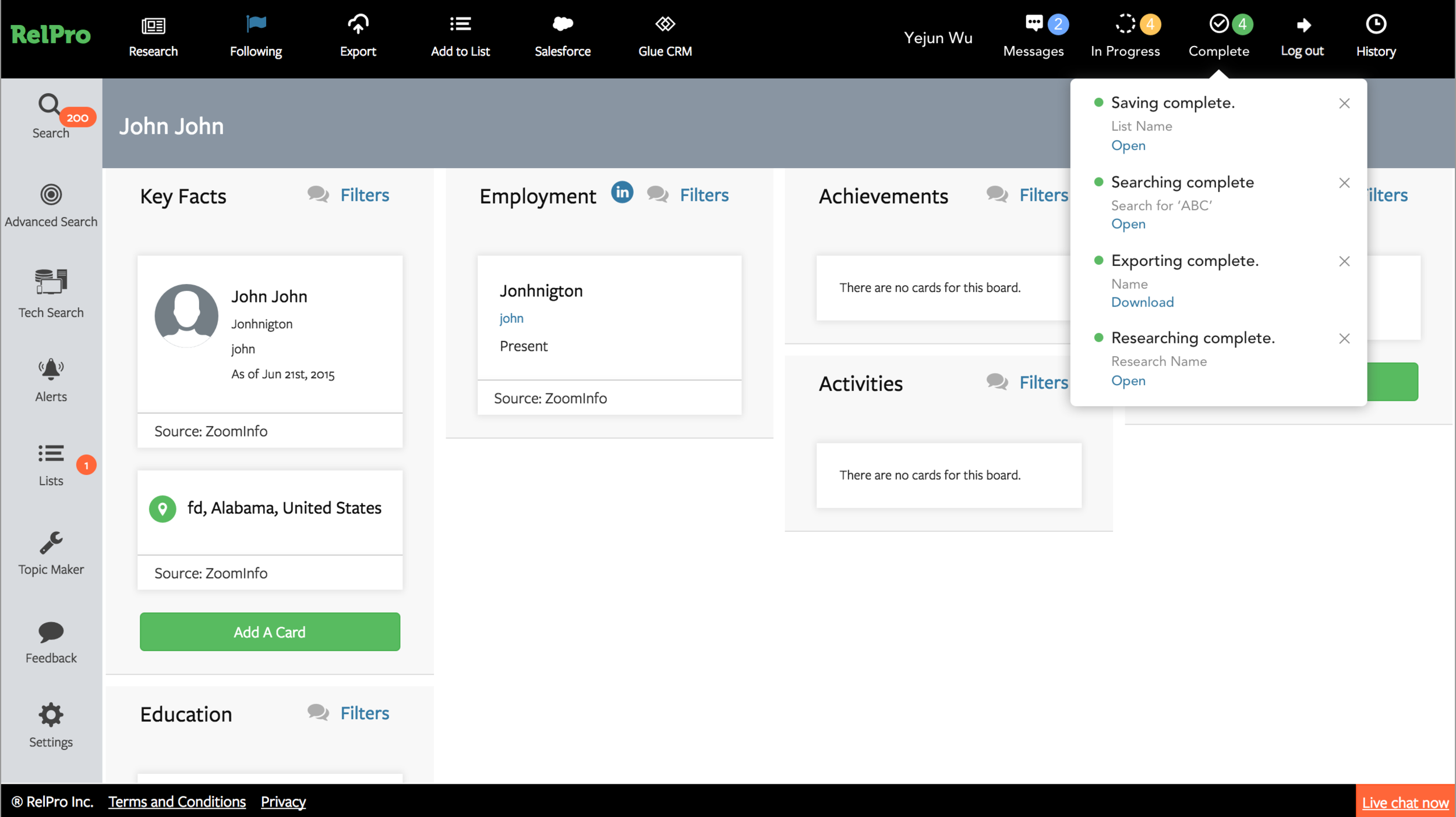
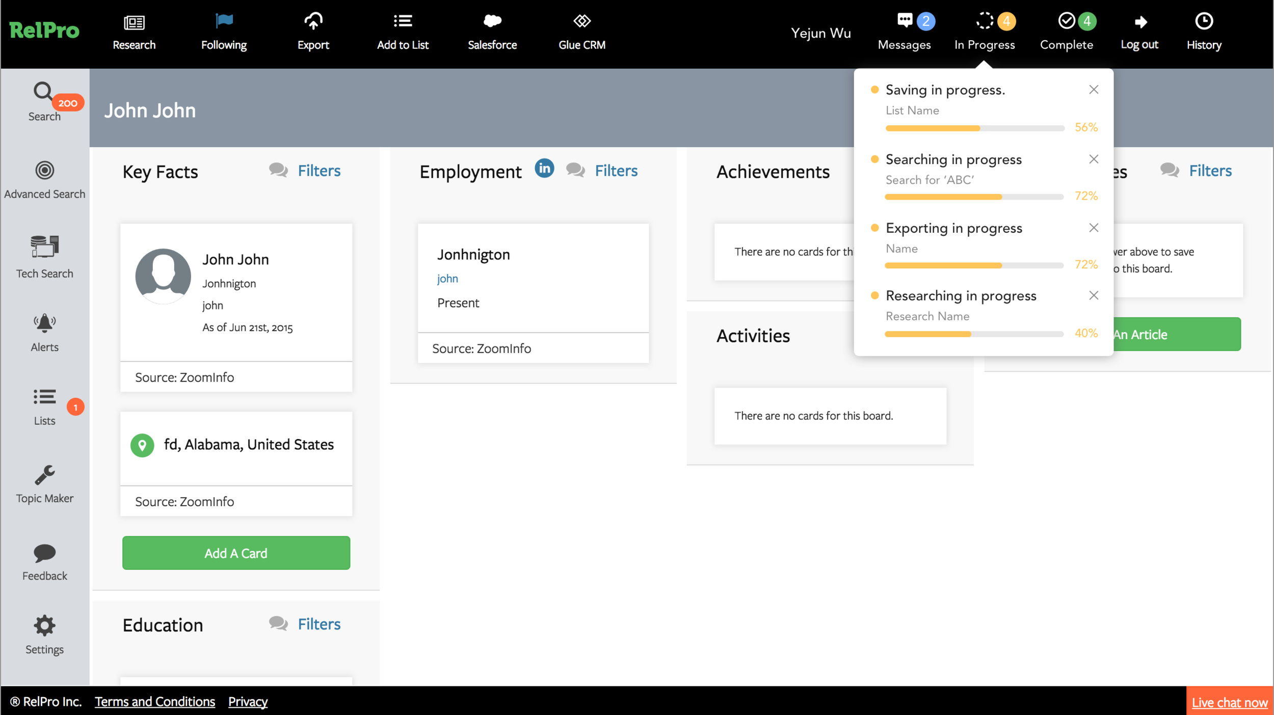
I also replaced the sticky notifications on the bottom left side of the screen with a notification tab on the top navigation bar. By analyzing all the notifications before, I categorized them into three main tabs: Messages, In Progress and Complete to allow users to manage their notifications efficiently while browsing search results with little disruption.
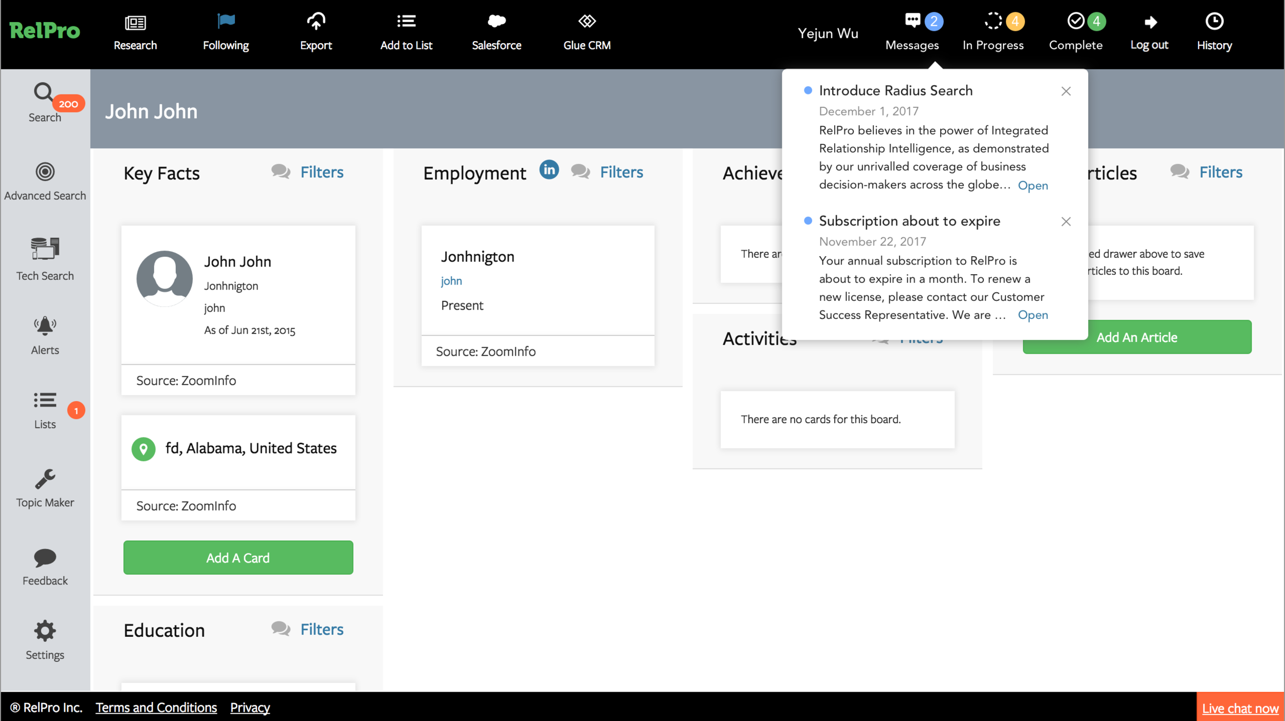
Since RelPro partnered with other people and company databases to aggregate all trusted information to our platform, we also credit to other data sources and aliases from other sources of each category through a pop-up window. Users can filter out data sources and compare aliases according to the number of data sources.
What I learned
Co-designing with clients and users was a great way to find solutions that truly meet people's needs. Through extensive interaction with our users by the Customer Success Team, I was able to collect updated user feedback to craft experiences that resonate more deeply with the audience by providing both consumer values and visual appeals.
The design process is a series of divergent thinking (building up) and convergent thinking (narrowing down). By collaborating closely with software engineers, I learned to recognize some technical constraints, which prompted me to continually revise the design of the user interface based on our data structure.