

Project Summary.
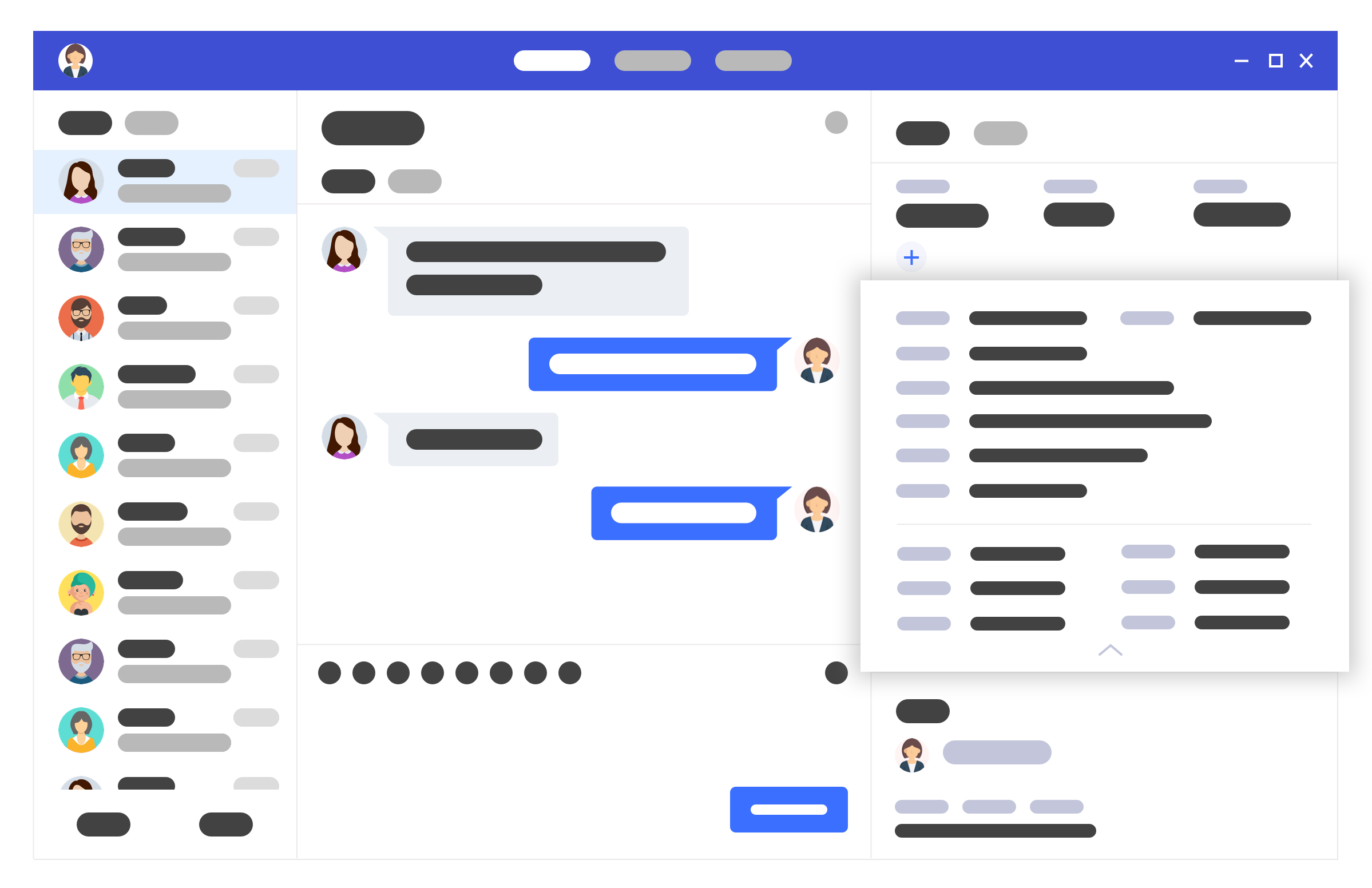
I joined Tencent, China’s social media giant famous for Wechat (1 billion MAU) and QQ (800 million MAU) as a UX Design intern in April 2018. I was working with Tencent Cloud’s CRM platform called Qidian. The core products include cloud-based sales & service analytics platforms and a desktop customer messaging app that helps various companies to connect with their clients seamlessly.
During my internship, besides regular tasks assigned by my supervisor, I self-initiated a project to redesign the client’s profile section of the desktop messaging app. After two months, I presented my final design to the stakeholders and it was approved by the product lead. As a result, my redesign has:

This design was scheduled to be implemented in the spring of 2019.
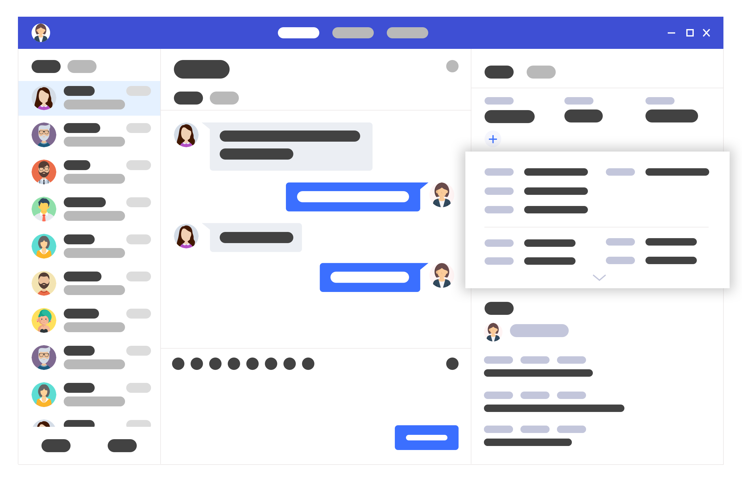
Project Demo
The Problem: The Faster Than Ever Customer Service Demand
Largely because of the influence of social media, today's customers expect an instantaneous response to their questions. That sense of urgency has transferred to a vital responsibility of customer relationship management (CRM) systems, requiring companies to have the right staff and technologies in place to respond to customers in a matter of seconds.
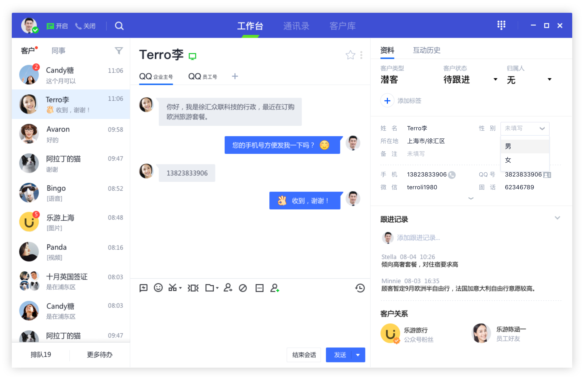
When I was conducting the initial heuristic evaluation of the messaging app, I found that users can’t efficiently engage with their clients while updating client’s information with the profile section on the right side. All the information outside is not clickable, users have to click on the little “edit” button to open up a distracting pop-up form to fill in or update client’s personal information, and click “save” to exit. Therefore, user’s time was wasted.
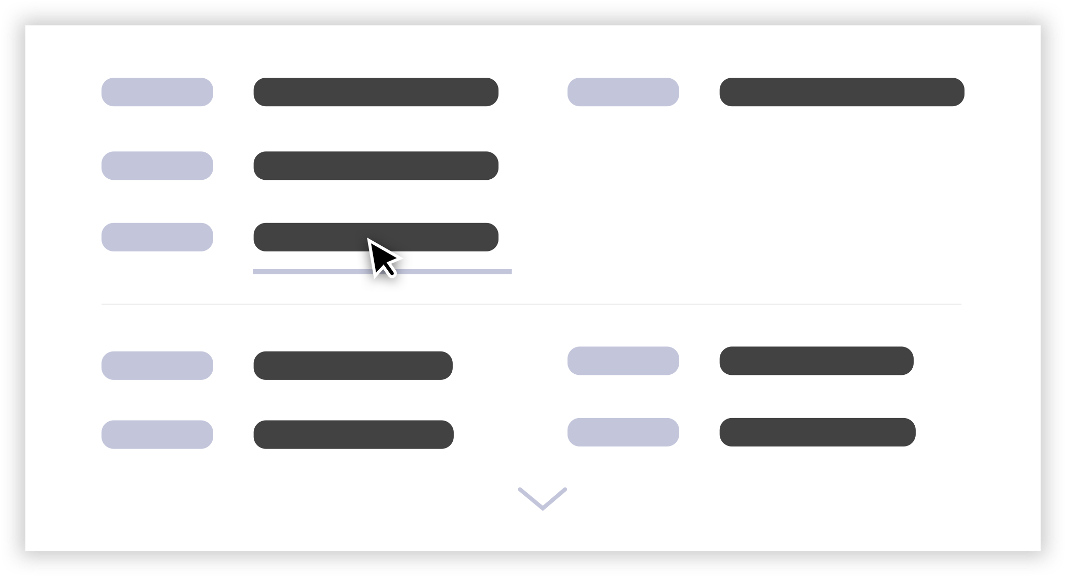
(Before: Pop-up Form to Edit Client’s Info)
User Research.
I started the research by participating our weekly user study program which allows designers to sit along with customer service representatives to observe real-time user feedbacks. During my observing session, I distributed a simple task to 8 different users, which is “in 30 seconds, imagine you are chatting with clients, can you update his/her employer info and add a new phone number for one of your clients?”
I also conducted competitive analysis on how trending CRM platforms including Salesforce, Zendesk and Intercom handled form interactions, especially in messaging experiences.

To our surprise, we found that users, especially first-timers, usually take much more than 30 seconds to complete this seemingly simple task. There were a variety of confusion arise as users were interacting with the client’s profile section, such as:
“Why should I open up a large form each time when I just want to add one piece of info?”
Based on the insights from our research and mentored by senior UX designers, I initiated an analysis of current user flows of the messaging experience. We found that currently it took users 2 to 3 clicks every time they want to edit clients’ information, especially when they want to add contact info. Also, opening up the pop-up form could significantly distract user’s attention and interrupting their engagement with clients.

Ideation.
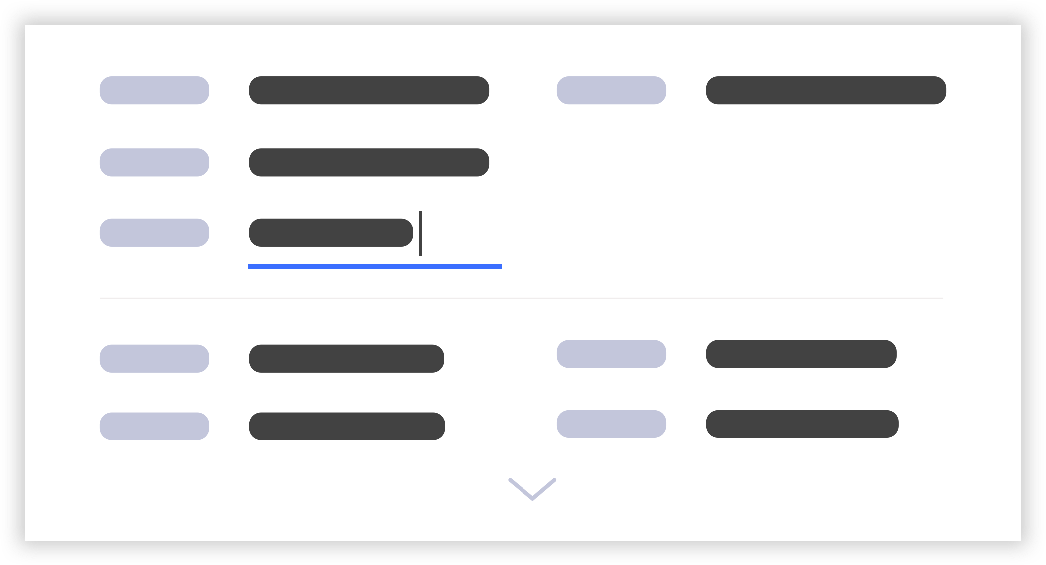
To save users’ time, I came up with the idea of an embedded form, which contains all the current client’s information and automatically save every change for users.
Scenario: a client had provided his mobile phone number and employer information during the chat and the company wanted to promptly update his profile while keep chatting with the client.

Wireframes.
I started the initial sketch to incorporate in-line editing and auto-saving for client profile in the messaging interface.
Hover - Edit - Auto-Saved!
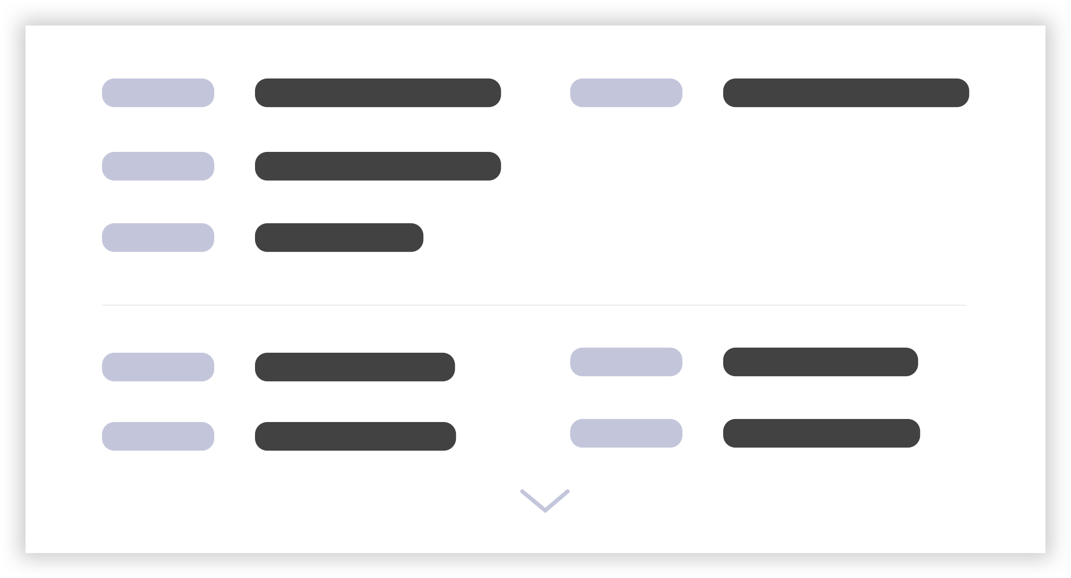
(Embedded Form: Collapsed and Expanded)
The Challenges.
However, during the next week’s design critique, when I proposed my initial wireframes to fellow designers, I received concerns about abandoning the current traditional form structure. Some designers were worried about that without the save button, users would no longer receive explicit instructions to save their data and would end up expecting that they haven’t committed to anything.
Another concern was about the size of the new smaller embedded form, in which the information is limited to a certain extent depending on the size of the messaging interface. However, with the previous pop-up form, companies were able to add as much client’s information as they want.
Iterations.
Facing all the feedback and challenges from the design critique, I spent about a month researching and iterating this project. After consulting the product managers a few times, I confirmed with the design team that the main user goal here is to quickly editing client’s information while chatting with them, and the priority lies in the efficiency rather than the security of information. Therefore, it’s proper to use in-line editing here to save users’ time and effort.
On the other hand, to solve the space issue brought about by the embedded form, I collaborated with back-end software engineers to analyze the most frequently used client’s information, such as first and last name, phone number, and location, and sort them by priority.
I also spent a lot of time meeting with product managers to propose the extensive usability of inline editing and auto-saving, which can be used in other sections of our platform. And finally after almost a month, my redesign was approved.
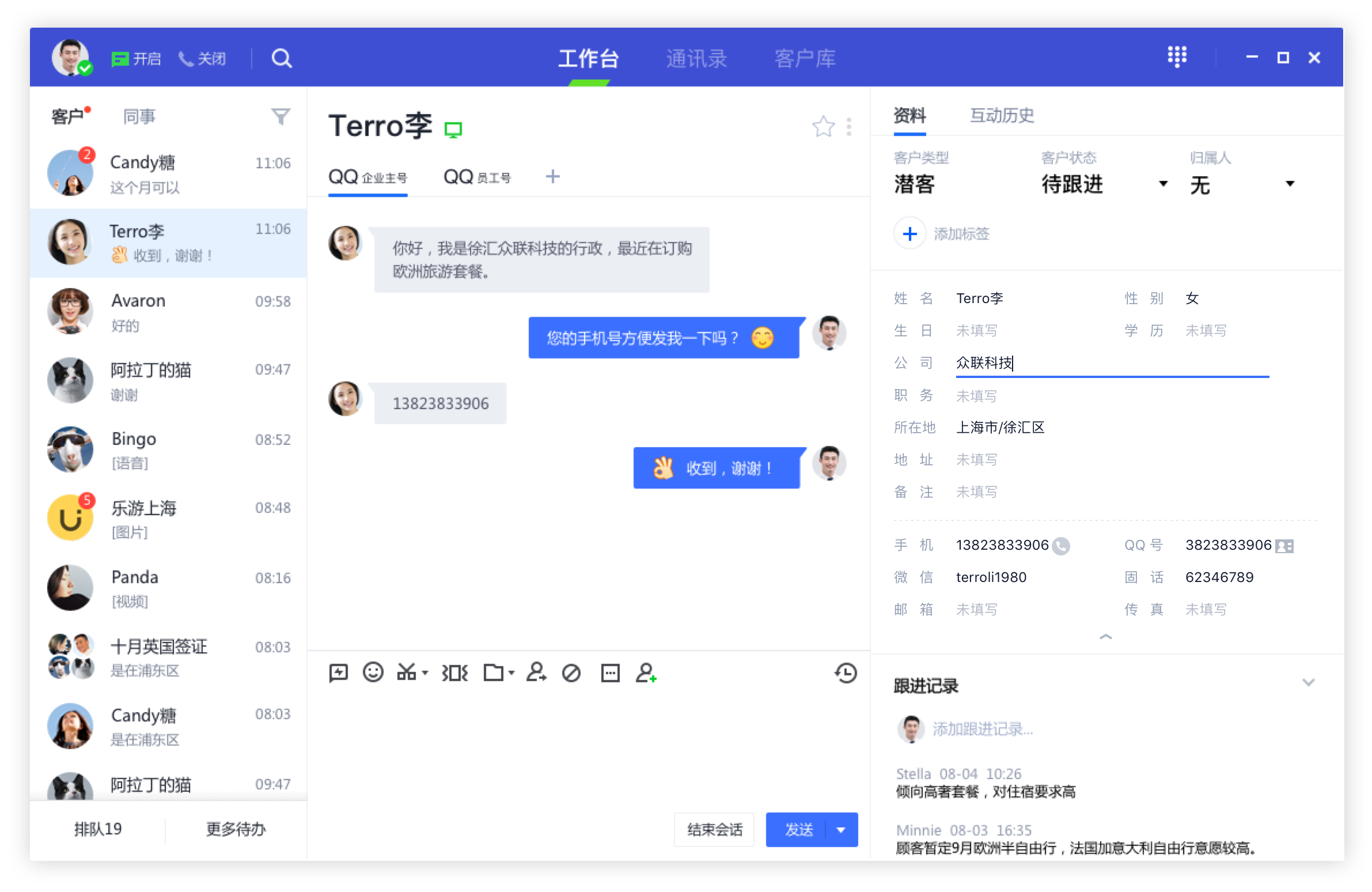
Final Deliverable.
My final design displays these most frequently used info in the embedded form no matter if they are filled or not, and have the other less used info collapsed to save space for other sections in the messaging interface. Once users input the other info, such as employer name and position, they will automatically display outside for easier editing. Before I created the final demo, I also advocated the benefits of using in-line editing in the messaging interface to the developers and they agreed to take extra time to develop this new feature.
Result.
On my last day of internship at Tencent Cloud, I presented the entire design process and my final deliverables to the stakeholders, including the CEO, the design lead, and the product lead etc.. They approved the final design and agreed to incorporate inline editing and auto-saving to our current design system.
Reflection.
This was my first time to work as a UX design intern in such a large design team (20+ designers). Compared to smaller design teams, I’ve experienced the ease to design with an established design system and the challenge to break it. It is necessary to always design based on existing components in the current design system to maintain consistency. However, it’s also vital for UX designers to always question ourselves before execution: “Is there a better way other than to use the existing components to maximize usability and benefit the users?”. Customer is the front and center. Sometimes it’s ok to advocate new components to update the design system.
Because the business goals and needs vary from enterprise to enterprise, designing experience for B2B products can be way more complicated and challenging than for 2C products. Therefore, before designing every feature, it takes UX designers and researchers extra efforts to analyze and define user needs rather than simply imagine based on our own experience.
Team & Culture.
Besides weekly design sprints and meetings, we had a monthly story & skill sharing session with design teams from other companies. In June, we invited InVision Design Lead Pablo Stanley to share his experience in leading a successful remote design team.

